
Wolf Shack
THE PROJECT
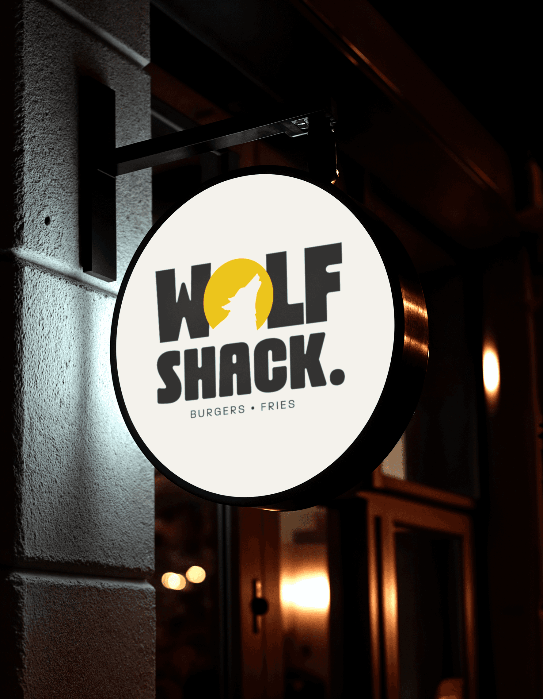
There's a specific kind of hunger that only one thing can fix. Not just food, the right food. Comfort food that hits hard, tastes dangerously good and makes you forget everything else for a moment. WolfShack was built for exactly that feeling. The name already said everything. Bold, raw, unapologetic. So the brand had to match it. We leaned into the idea of dangerous deliciousness: that moment when hunger takes over and you just devour. No apologies, no holding back. A visual identity that's loud enough to make you stop, warm enough to pull you in and bold enough to make you feel like you've found your place. This isn't just a burger spot, it's THE WOLF WAY. A whole attitude toward flavor, risk and the kind of food that becomes your ritual.
Year
2024
Client
Wolf Shack
Services
Brand + Brand Essence + Packaging




More works
